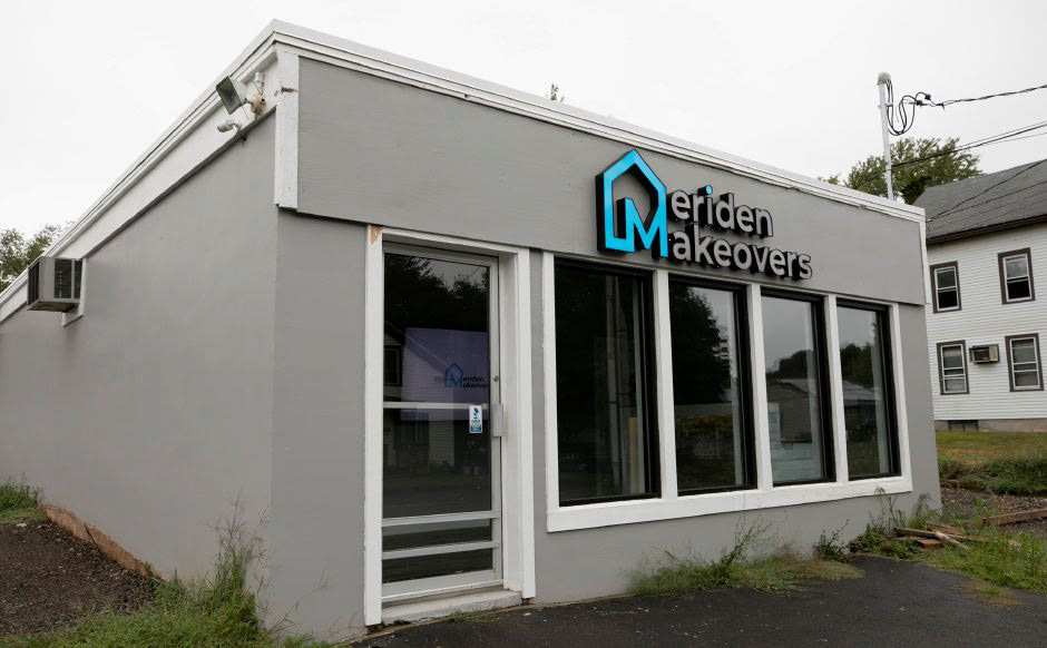
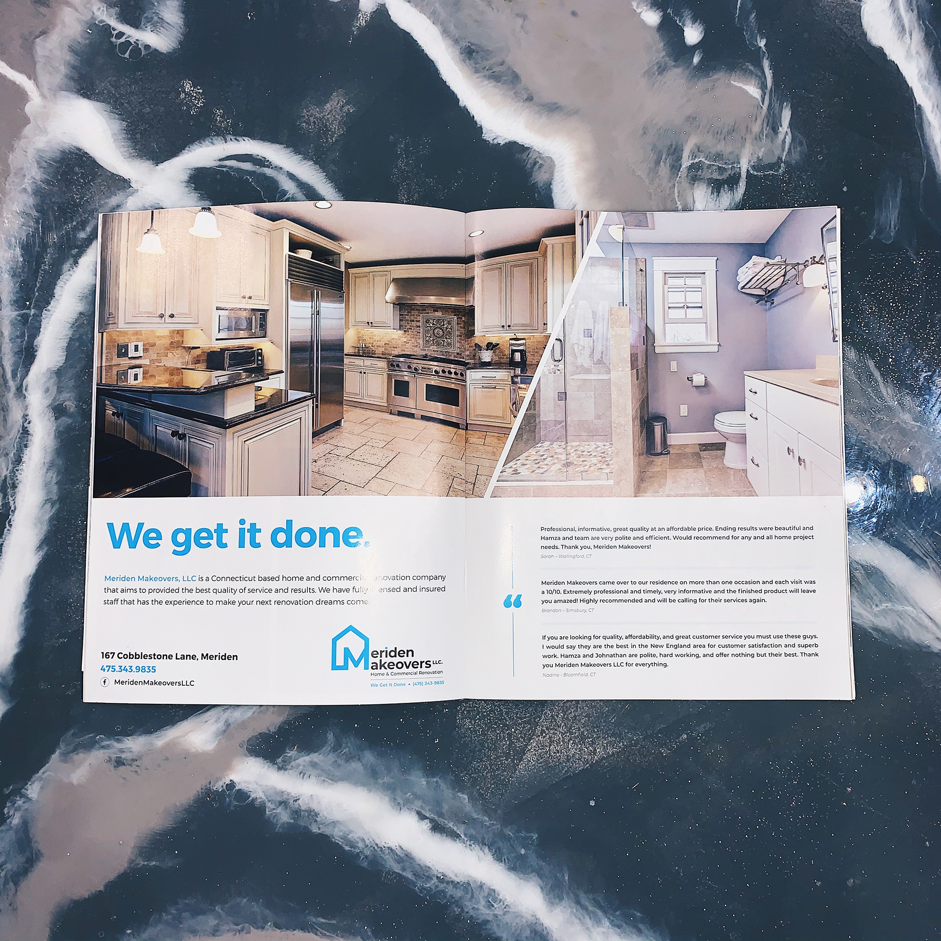
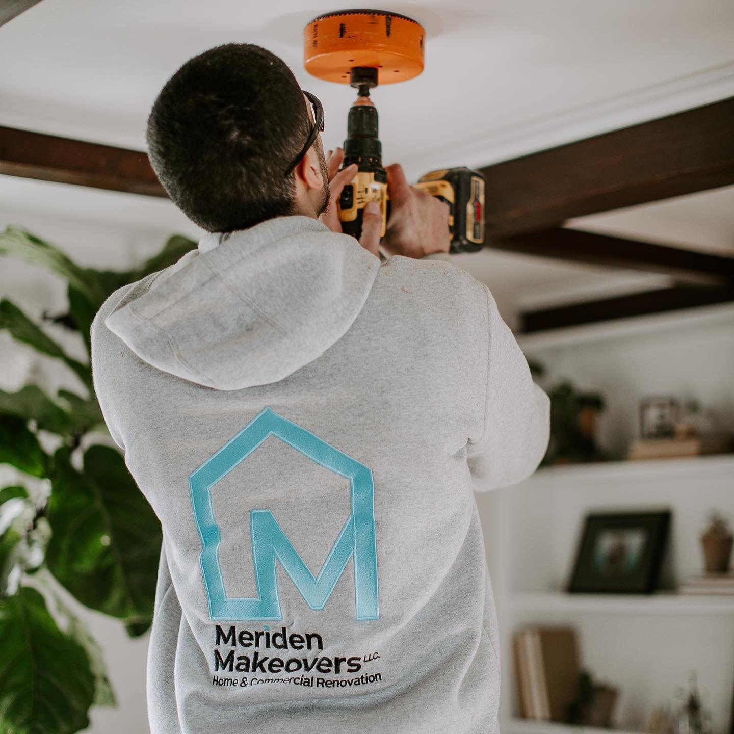
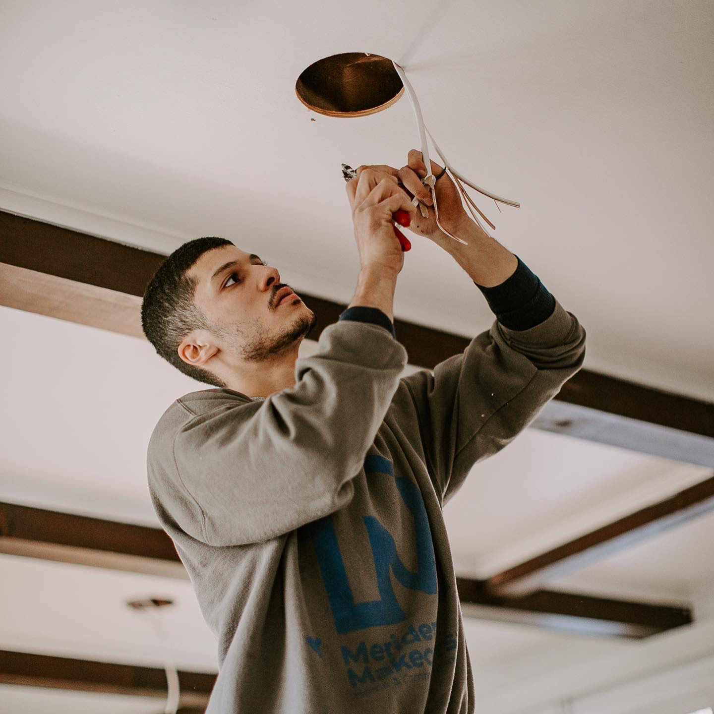
When my childhood friends from Meriden Makeovers wanted to finally open their doors, they came to me to create a new identity for their business. I was honored to create a brand system that can easily be translated across all their marketing. From social media, to print, and even video they were excited to have a logo that best represents them and their hard work.

The idea was to use the typography of the company’s name to create a graphic that can be recognized as a stand-alone logo. The icon of the house combined with an M works perfectly relating to the field of work but being a unique graphic that client can call their own.